
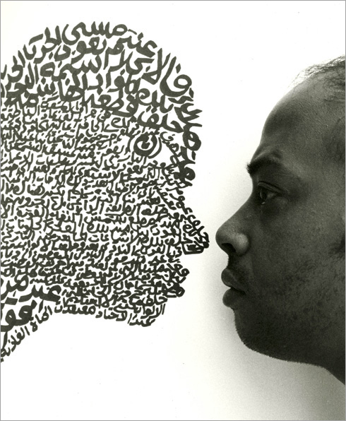
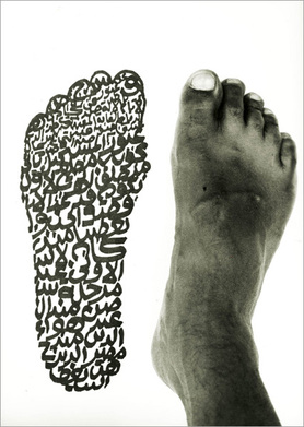
For the past couple of weeks I have been developing lesson plans for an arts and culture grant to provide money for a local non-profit organization's art program. One of the lessons I'm particularly eager to put into practice in the future focuses on artist Fathi Hassan. Hassan is well-known for his work with calligraphy and symbols. I found the images above to be really powerful, and began developing a graphic design project for K-8 students.
Students will: Art Production: Create a graphic design of their footprint featuring personal descriptive words or symbols in the style of Fathi Hassan Art History: Compare and contrast Hassan's artwork with American graphic designs utilizing text. Art Criticism: Identify how Hassan uses size, space, and contrast to create his artwork. Aesthetics: Determine whether graphic design should be valued as fine art or not. Materials Needed: 8.5”x11” Scratch-Art Sheets Toothpicks Pencils The teacher will introduce students to images and video clips of Fathi Hassan’s artwork. Students will be asked to describe the artwork, and analyze potential meanings. The teacher will ask students to describe how Hassan used calligraphy to fill the positive space. Guided Practice: Students will: 1. Trace their shoeprint onto the scratch-art paper lightly with a pencil 2. Write personal descriptive words or draw symbols within the interior of their shoeprint 3. Be encouraged to change the style and size of their text and symbols to create an interesting composition 4. Photograph their shoe next to the design as Hassan did with The Light Man’s Historical Footstep (1985) How is graphic artwork different than traditional drawing or painting? Is the scratch-art sheet the artwork? Or is it the photograph? Could it be both? What if this project were done using a computer? How does technology affect what we consider to be art?
0 Comments
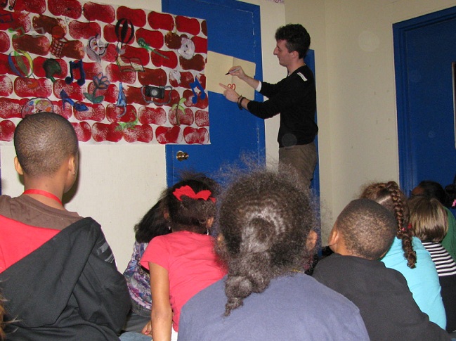 Last Friday I presented a lesson on graffiti art to students K-8 in a community center setting. I began with a brief introduction to the lives of Banksy and Jean-Michael Basquiat. We looked at a variety of images from both artists. The students described their use of color and debated possible meanings of each artwork. One student noted that Banksy used few colors, while Basquiat used several. They identified symbols such as: wings, hearts, a cross, figures, and televisions.
I asked the students to create a personal symbol. The symbol was to relate to their own unique interests. Each student created a stencil by drawing onto a manilla folder, and then cutting out the shape's interior. The stencil was held down while the student used oil pastels to tag a "brick wall." Prior to the activity, I had prepared three large sheets of white bulletin board paper to represent brick walls. The bricks were created using a large sponge with red and brown acrylic paint. Once students had tagged the wall, they were encouraged to move to another section and repeat the process. Students were also given individual sheets of construction paper to tag on, so they would have a work of art to take home. After the lesson, the collaborative murals were hung up at the community center for display. |
Mr. DeWilde's Blog
Archives
April 2024
|
 RSS Feed